Making it easier to find help content
Challenges:
A knowledge base for candidates is full of useful help articles to guide candidates in managing their studies, but largely due to the page templates available on the website and where the knowledge base sits within the overall site hierarchy, it is challenging to show what content is on offer in a clear and easy to access way.
At times content was 4 -5 layers deep within the site, and didn’t show up on the navigation at all.
It was often hard for our users to find relevant content.
Our parameters for an uplift were restricted to the available content modules already baked into the sitecore framework for use on any landing page/template and we couldn’t bring any new css/ or visual design elements to the templates/pages so we had to get creative.
Solution:
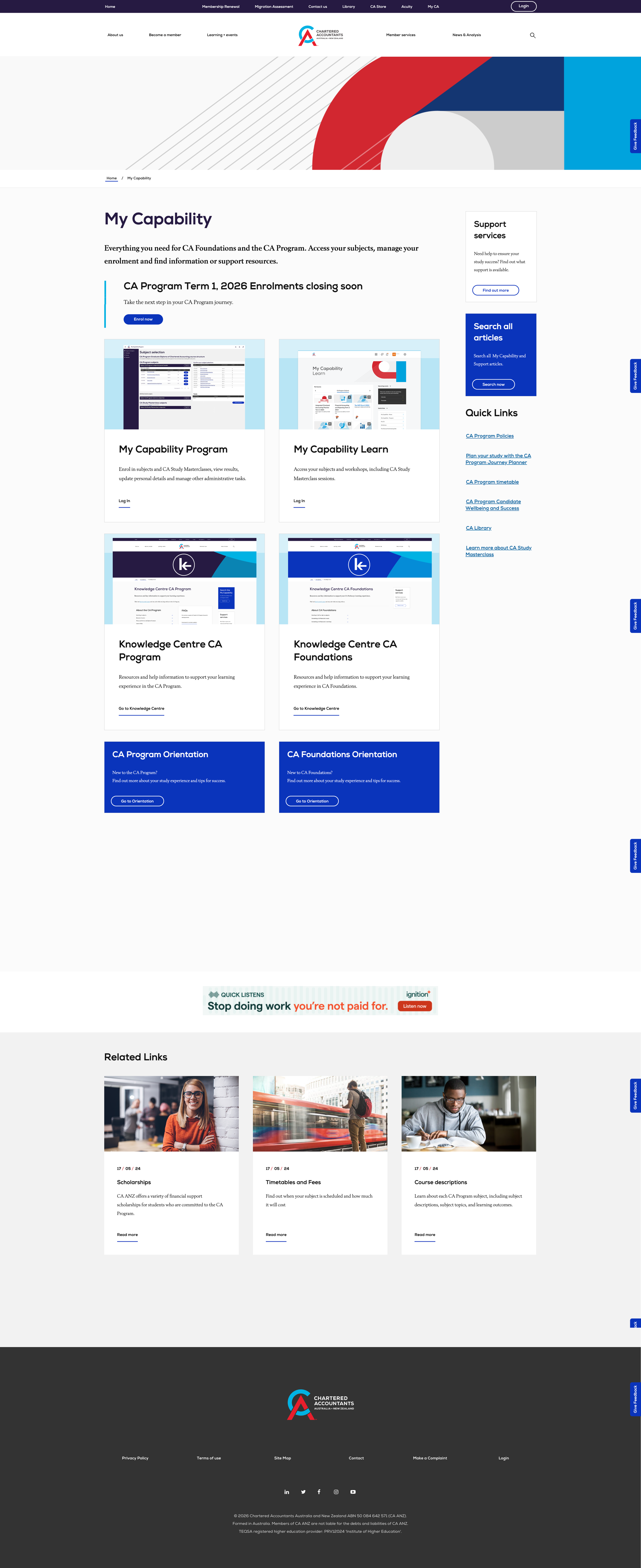
A child links module was identified, which aggregated sets of page links in a section and presented in a block on screen.
First we analysed all pages and allocated an owner for each page/to audit the content itself, to ensure each article focussed on one core pain point/need
Next we held working groups with SMEs and regrouped content into core themes that represented the customer experience/needs as at our current time
Then we set to work applying these ‘child link modules’ to higher up landing pages ONLY and removed layers of redundant landing pages.
And finally we did some imagery analysis - removing banner imagery on article pages as it was pushing content too far down the screen, and we added imagery to some tiles on the landing page to show what platforms each discussed/linked to - to aid users way finding satisfaction.
https://www.charteredaccountantsanz.com/my-capability/knowledge-centre
Imagery added of platforms - to any tiles that linked out to other portals to aid way-finding
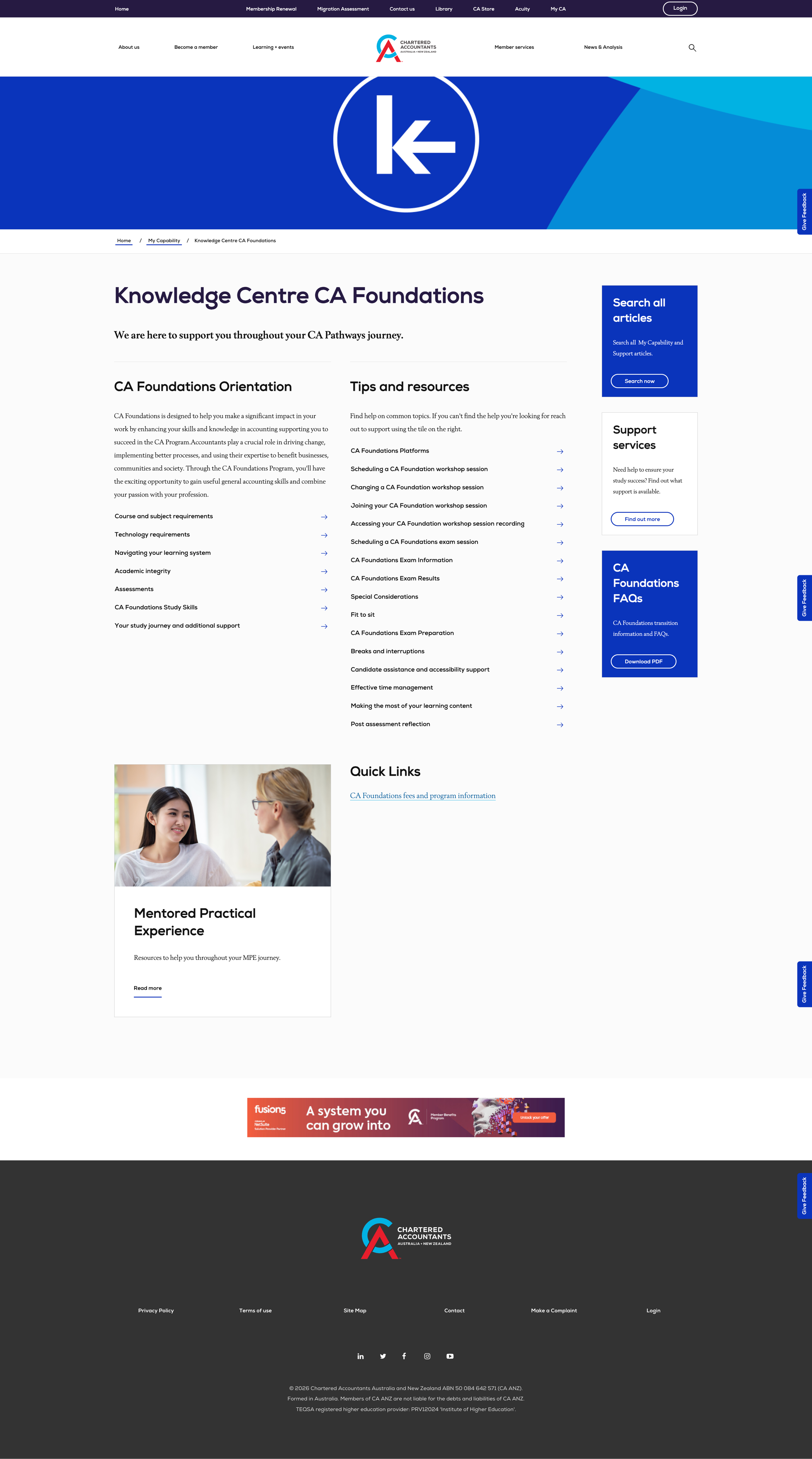
Simplified groups of links so users can SEE at a glance what content is on offer deeper in the site around key themes.

Groups of aggregated links added to landing pages to show whats on offer deeper in the site.